

Deeper into the enchanted forest we go. Seen one pink unicorn, seen them all. And what could possibly go wrong in a house made of gingerbread? Unemployment rates close to generational lows would at one time have been associated with budget balance or even a small surplus. In the enchanted forest, low unemployment co-exists with soaring budget deficits; rising real wages with falling participation rates; and rebounding GDP growth with an inverted government yield curve. If only we would leave our silly pre-conceived notions behind, then we could free our minds to embrace the absurd, the grotesque and the downright impossible. Back in the real world, US and UK fiscal trends are truly terrifying.
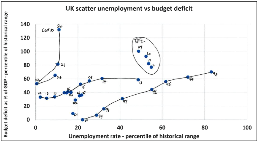
This blog presents familiar information in a novel format. It’s always fun to cram three dimensions into two-dimensional space. Figures 1 (US) and 2 (UK) plot a scatter of the budget deficit, expressed as a percentage of nominal GDP and scaled by its historical range (1972-2019) against the standardised measure of the unemployment rate (U3 for the US; LFS:ILO for the UK), also scaled by its historical range (1972-2019). The lowest unemployment rate and the strongest fiscal performance score zero; the highest unemployment rate and the weakest fiscal performance score 100.
In the period 1993-2000, the US scatter traces out a diagonal line, kinked in 1995, falling from right to left towards the origin (0,0). The wildness of the global financial crisis – characterised by high unemployment rates and extremely high budget deficits – shows as an ellipse at the right-hand side of the chart. The years 2012-19 show another consistent pattern of falling unemployment, but with no corresponding improvement in the budget position after 2013. Under the influence of Covid, the chart flies into unexplored budget deficit territory but with restraints on the rise in unemployment. The key point to note is that the promising fiscal normalisation of 2021-22 has given way to an upward lurch in 2023. The US budgetary position is currently worse than in the recession-hit years of 1975 and 1982-83 (on the extreme right of the chart).
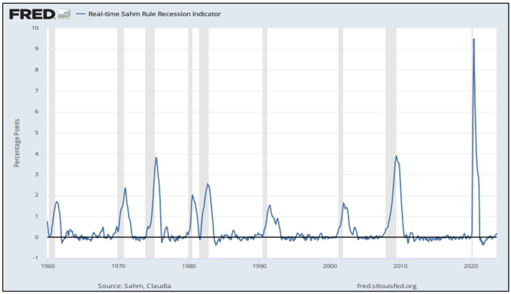
Figure 3 presents the credentials of the real-time Sahm Rule Recession Indicator. The Sahm Rule identifies signals related to the start of a recession when the 3-month moving average of the U3 rate rises by 0.5 percentage points or more relative to its low of the previous 12 months. The September reading is 0.2 percentage points, which remains below the recession signal threshold, but this is one to watch. Should recession strike the US in 2024, the line in figure 1 would surely head relentlessly up the page.
Figure 2 profiles the UK experience, which aligns quite closely with that of the US. The same falling right-left diagonal is identified in 1993-2000, there is a similar but less extreme version of the GFC ellipse in 2009-12, followed by a much flatter, but still mildly descending, curve between 2013 and 2019. The orbit of the Covid years looks very different to the US, but largely because furloughed workers were not classified as out of work in the UK, in contrast to the US. In 2023, there is the same pattern of fiscal deterioration but with a softer trajectory. The fiscal adventurism of the Truss-Kwarteng government was slapped down by the Sunak-Hunt government that followed swiftly on its heels. The stark conclusion, however, is that the US and UK are each tracing out a new curve in unemployment-budgetary space. There is no conceivable cyclical development that looks capable of restoring a semblance of budget balance.
Figure 1:
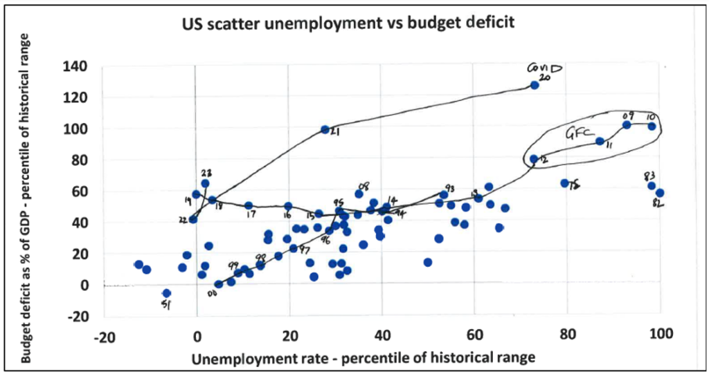
Figure 2:
Data source: Macrobond
Figure 3:
Sahm Rule Recession Indicator | FRED | St. Louis Fed (stlouisfed.org)